I read multiple articles on the internet about automatically opening/closing your gate for your car based on the GPS in your cellphone. When you enter/leave your home zone, the cellphone triggers the opening/closing. To make sure it works properly, stick a sensor on your gate to sense that the gate was properly closed. And use a tiny script to integrate it. A task for an hour, at worst a day, right?
I thought so as well. But I was wrong. Murphy's Law says that if something can fail, it will fail. In this case, everything initially failed. If you plan to automate your gate, I hope my observations will save you some time. The content is divided into 3 sections: location sensing, gate position sensing, and integration.
Location sensing: I use an iPhone. It has GPS and cellular internet. It should work, right? And it did. However, the iPhone checks whether you have entered/left a zone only once per 30 seconds (or a minute, I do not recall exactly). That means that if you enter the home zone, the gate can start opening immediately, after 30 seconds, or anything in between. One option for how to deal with that is to start opening the gate when I am still far away. However, what if I stop by a nearby shop or a restaurant when returning home? Then the gate will stay open, potentially for hours (or until a timeout). That is not ideal. Another option is to wait in front of the gate for up to 30 seconds until it opens. That is more irritating than pushing a button on the remote control. No thank you.
I researched how to increase the zone testing frequency. However, the iPhone does not allow you to touch the hardware. And it does not allow you to run a background process indefinitely. Hence, you can't just keep triggering the GPS in a wait loop without running the app in the foreground. Hence, I decided to use dedicated hardware: iBeacons. With iBeacon, the maximal delay in location sensing was less than 1 second. Awesome! However, the reach was ~50 meters. And I wanted 170 meters. After a bit more research, I ordered devices with 4× higher reach. But that was false advertisement. It had exactly the same reach. I concluded that this is a dead end.
After rereading the internet articles, I realized that all the authors were using Android. So I tested Android. It had a maximal delay of 5 seconds in sensing the zone changes. That was... acceptable. Unfortunately, it was draining the battery so much that by evening the Android was dead. But I wasn't giving up. The Android doesn't have to keep sensing the location frequently all the time. It is fine if it does so only when it is in my car. Commonly, it is done by sensing a Bluetooth connection between the cellphone and the car. But my car does not have Bluetooth. I could have sensed the iBeacon, which I had in the car from the previous experimentation. But I decided to mitigate the battery drain issue as well and I purchased a wireless charger for the Android. When the Android is charged by that specific wireless charger, it switches to high-frequency location sensing. Once it disconnects from the wireless charger, it switches to the normal refresh frequency. And that worked. Until it didn't.
When a cellphone attempts to get its location after a long pause (e.g., in the morning), it needs to update its GPS ephemeral data. It can download it directly from the satellites, but it is (usually) faster to get from the internet (i.e., it uses "assisted GPS"). Unfortunately, assisted GPS does not work well when you are in the middle of a Wi-Fi to cellular handover (a common occurrence when I am leaving my home). While the handover for normal processes is close to seamless, for assisted GPS, it isn't. The download process has to first exhaust memory and get killed by the kernel... And only once it is restarted, it successfully downloads the ephemeral data over cellular internet and I finally get my location. I decided to mitigate the issue by switching to unlimited internet on my phone and just always use cellular internet. Another nuisance was that GPS was sometimes providing location estimates that were kilometers off, just to correct itself in the next second. Fortunately, all that was needed was to reject measurements that had higher inaccuracy, as reported by GPS itself, than ~100 meters.
Gate position sensing: For sectional garage doors, it is customary to use a tilt sensor or two magnetic sensors to sense whether the door is truly closed/opened. After experiencing all the issues above, it was clear to me that this cannot be skipped. However, I didn't want to place a battery-powered magnetic sensor on my swing gate as the battery would not survive long in the winter. So, I got a bright idea to reuse my camera, which was already pointed at the gate. I got it working in the day, at night, at dusk (tough, as neither IR nor the visual spectrum is giving a good picture at this part of the day), in haze, with partial occlusion by people, cars, snowflakes, and flying bugs. I have dealt with sun glare by 3D printing a lens hood. And when I realized that there is still going to be a brief moment in the year when the sun blinds the camera even with the lens hood, I felt like Indiana Jones in Raiders of the Lost Ark. And I planned to install a second camera aimed at the gate, just at a different angle. That way, as long as there is at most one sun in the sky, I get a clear picture of the gate. For a while, it worked. Until it didn't. Somehow, dandelion seeds managed to attach to the glass lens and screw up my image processing. I had enough. I decided to install the magnetic sensors that I should have installed right away. After studying the exploded diagram of the engine that powers my gate, I found convenient places to place wired magnetic sensors. After debouncing the signal from the mechanical relays in software, it worked reliably. Success.
Integration: At this point, it would be suspicious if everything worked right away, wouldn't it? But all I had to deal with was race condition in the processing code.
TL;DR: For automatic gate opening:
iPhone DIDN'T WORK
iBeacon DIDN'T WORK
Android WORKED
Camera DIDN'T WORK
Magnetic sensors WORKED
neděle 3. května 2026
How not to automatically open the gate

čtvrtek 25. prosince 2025
How to identify faulty sensors in home automation
Home automation tend to be unreliable as it is composed of many individual components. If each component has 99.9% reliability, we have 100 statistically independent components, then we have only 99.9^100=90.5% chance that everything works. That is not much. Hence, we need to monitor the components and alert when they brake down.
I use 5 types of heuristics to trigger an alert that there is an issue with the sensor. For illustration, I will explain them on a wireless battery powered thermometer sensor:
- Too low/too high. When temperature in a boiler is above 90˚ C or below 30˚C, it is a sign of troubles.
- Unavailable. When the temperature reading is unavailable for 15 minutes, battery in the sensor died or the sensor got water damaged.
- Stuck. When the temperature reading AND signal strength (RSSI) is stuck at the same value for over 24 hours, the battery voltage is too low or the sensor needs to be restarted. I like to combine multiple sensors from the same device to decrease the false alert probability when it is plausible that the same value reading is legal. For example, the temperature in my basement is constant as long as no one opens the basement doors. Hence, if I measured only temperature, it would result in false alerts. On the other end, the battery powered thermometer next to the server is so close that RSSI is always at the maximal value. Hence, an alert based on RSSI alone would give false alerts. By requiring temperature AND RSSI to be stuck, I can use the same code for all my thermometers without false alerts. And I do not have to think about whether the particular sensor has more variable temperature or RSSI.
- Rapid change. Generally, when the temperature is increasing too quickly, it might be a sign of fire. Or that the battery is almost empty and the sensor became erratic.
- Noisiness. When the standard deviation of the temperature over the last hour is too high, the battery is dying.
Nevertheless, my single favorite alert trigger for network based sensors is a check whether the sensor's web page is loading, or not. It happened to me multiple time that a sensor was answering on ping. But otherwise the device was unresponsive. Hence, a ping is not sufficient. However, a simple HTTP status code check so far worked reliably and universally across all my network devices.
Does it mean ping alerts are useless? No. Once I had a faulty device. So I filled a warranty claim. But the claim was denied because "I have unreliable network and should hire professionals to fix it". So I presented them with the ping and HTTP status code historical logs for the device. The device was answering on ping. But web was 404. This was enough for them to accept the warranty claim. If I didn't have the ping logs, they could have claimed that the Ethernet cable was faulty... But the fact that ping worked continuously for a week silenced them. Hence, having multiple alert triggers, even if they partially overlap, payed off for me.
středa 22. ledna 2025
Reduction for the parallel port on Brother printers
Brother printers do not use a traditional Centronics 36-pin that you can find on other printers or 2-row 25-pin D-SUB parallel port (LPT) that you find on computers. Instead of that, they use a smaller 3-row 26-pin D-SUB connector. And new printers do not come with a cable/reduction to LPT. You have to go and buy the reduction from Brother under name "PC-5000".
On one end, I understand Brother. If I were them, I would also want to know how many people still need LPT. And by selling the reduction separately you get the count. On the other end, the cable sells for a quarter of the printer.
Since the reduction is nothing else but a simple wire reduction that you can solder from and old LPT cable and a new 3-row 26-pin D-SUB connector for 2 dollars.
The wiring is simple. Pin 1 on one connector goes on pin 1 on the other connector. Pin 2 on one connector goes on pin 2 on the other connector. And so on. Pin 26 does not have its counterpart and is left unconnected. Ground goes on the ground.
For reference, I include wire colors on my cable (note: they might be different from your cable). And the pin numbers are the numbers on the D-SUB connectors on the cable.
D-SUB 26:
| 1 | black | 10 | white | 19 | black white |
| 2 | brown | 11 | pink | 20 | brown white |
| 3 | red | 12 | azure | 21 | red white |
| 4 | orange | 13 | red black | 22 | orange white |
| 5 | yellow | 14 | orange black | 23 | green white |
| 6 | green | 15 | yellow black | 24 | blue white |
| 7 | blue | 16 | green black | 25 | purple white |
| 8 | purple | 17 | grey black | 26 | not wired |
| 9 | grey | 18 | pink black | ground | shielding of the cable |
D-SUB 25:
| 1 | black | 14 | orange black |
| 2 | brown | 15 | yellow black |
| 3 | red | 16 | green black |
| 4 | orange | 17 | grey black |
| 5 | yellow | 18 | pink black |
| 6 | green | 19 | black white |
| 7 | blue | 20 | brown white |
| 8 | purple | 21 | red white |
| 9 | grey | 22 | orange white |
| 10 | white | 23 | green white |
| 11 | pink | 24 | blue white |
| 12 | azure | 25 | purple white |
| 13 | red black | ground | shielding of the cable |
Just note that the 3-line D-SUB is a bit overcrowded in comparison to 2-line D-SUB. You might want to start from the middle row and use a micro soldering iron.
pondělí 25. listopadu 2024
Better debugging UI for CTE
One of the great advancements in SQL was introduction of Common Table Expressions (CTE), which made creation of long queries without creating intermediate tables on disk (or temporary tables if the database supports it) convenient.
However, debugging of long CTEs is difficult. To find the bug, I currently use bisection. I modify the query to show the first rows of some intermediate CTE somewhere in the middle of the query. If the CTE result looks OK, the bug is somewhere in the second part of the query. If the result does not look OK, I know that the bug is in the first half of the query. And this process repeats recursivelly, until I pinpoint the single offending CTE.
This approach works well on quickly running queries. However, once each query execution takes long time, the debugging drags as it requires multiple executions to just find the offending CTE, let alone to fix the CTE.
A possible mitigation is to enhance the query editor. Just like some query editors allow you to fold CTEs, the editor should present these information for each CTE:
- the CTE's row count
- an icon, which on click opens the CTE result
These informations should appear in the editor progressively, as they get available. With this approach, identification of the offending CTE should require, at most, 1 complete query execution. If you are lucky, just by looking at the row count of the intermediate CTEs, you spot the issue while the query is still running.
Technical limitations:
- The database ought to support temporary tables. This is needed for a simple implementation of the CTEs' result preview.
- While in the debugging mode, optimisation techniques that work across CTEs, like predicate pushdown, will not be applicable. This is acceptable as programmers expect a slow-down in the debug mode. However, it means that there has to be an additional "Debug" button next to the ordinary "Run" button. These two modes can't be mixed.
Future enhancements:
Do we want to store whole CTE results or only the top 1000 rows? If we store whole tables, we can use that to warm start the query execution, once we modify the query. The disadvantage of storing the whole results is that even a single query in the debugging mode can exhaust disk space and consequently prematurelly terminate, while in the ordinary run mode the query may finnish without any issue. Hence, the limit mode will likely have to be implemented. Nevertheless, for testing of the core idea, the limit/warm-start functionality is not needed.
středa 22. listopadu 2023
Google maps' color palette
Once again, google maps changed the color palette. And once again, people are unhappy about it. The change is supposed to improve clarity on low-quality car displays. But it seems to make people with high-quality displays unhappy.
I say, that a single color map can't make everyone happy. Some people are color-blind, hence preferring "50 shades of gray". Other people see the colors but have a crappy display that can't distinctly show more than a few levels of gray, hence preferring "papagayo colors".
The solution is to let people to define their own palette per navigation type (no navigation, by car, by public transit, by foot, by bike,...) and share the palette configurations. This will take care of:
- eye and display imperfections,
- differences in the opinions of what type of information is important (if nothing else, it is reasonable to assume that this differs from one biome to another),
- personal preferences (when you are for years accustomed to one palette, you might prefer to stick to the palette, simply because your brain can navigate the old palette faster than the new one).
neděle 23. července 2023
Dataframe API design
However, dataframe libraries are notoriously tedious to implement, because a dataframe library should be feature-rich.
There were multiple attempts to simplify to problem.
One notable approach is to implement only operations on rows. And if you need to do something on columns, you first transpose the dataframe to convert the columns to rows. This simple trick reduced the size of API (count of methods) by roughly 1/3. Unfortunately, heterogeneous (composing of multiple different data types) dataframes are not the easiest to transpose. The author of the approach solved it by using dynamic typing - each cell contained information about its data type.
Can we further reduce the size of the API? I argue that the answer is yes. Each dataframe should have its own metaframe, which is nothing else but a dataframe with the metadata about the dataframe's columns. Metadata like column names, data types (like in information_schema.columns in SQL databases) and statistics like count of missing values, count of unique values, average, standard deviation and so on, which can be used for queries or query optimization. And these metadata should be manipulable and editable with exactly the same API as dataframe.
Hypothetical examples in Python syntax:
print(df) # some dataframe instance
print(df.mf) # the dataframe's metaframe
print(df.some_column_name) # prints a column named "some_column_name"
# Rename a column.Metaframe should be open for addition of new columns as needed. For example, do you want to calculate feature importance and then filter based on that? Sure enough we can store the feature importance in an independent array and then filter based on the array:
# Commonly we would have a dedicated function or a method for this like:
# column_name(df)[3] = "new_name"
# or
# df.rename(columns={"old_name": "new_name"})
# but we reuse ordinary syntax for dataframe manipulation:
df.mf.column_name[3] = "new_name"
# Select columns without any missing value.
# Commonly we would have a dedicated function or a method for this like:
# df[:, ~any(isnull(df))]
# or
# df[:, ~df.isnull().any()]
# but we reuse ordinary syntax for dataframe manipulation by using missing_values column in the metaframe:
df[:, df.mf.missing_values == 0]
# Select columns with "good" substring.
df[:, regex(df.mf.column_name, ".*good.*")]
# Select integer typed columns.
df[:, df.mf.data_type=="integer"]
# Cast a column to string. Implementable with https:#stackoverflow.com/questions/51885246/callback-on-variable-change-in-python
df.mf.data_type[3]=="integer"
feature_importance = get_feature_importance(df)
df[:, feature_importance>0]
But what if there are intermediate steps between feature_importance calculation and filtering, where you manipulate column position or add or delete columns? Suddenly, you have to keep feature_importance array synchronized with the df. And that can be tedious and error prone. But if you store feature_importance into metaframe, the dataframe library will take care of keeping it synchronized (when you add columns, the corresponding feature_importance value will be null - no magic).
However, if you wanted a bit of magic, the library might keep track of operations performed on columns and keep lineage of the columns. For example, the library might track which dataframes and columns were used in computation of the columns. This is useful in complex systems where it is sometimes difficult the origin of some data.
Implementation
Because we want to treat a metaframe as if it was a dataframe, metaframe has its own metadata. Hence, we get a never-ending chain of frames. This can be implemented as a linked list.
Without loss of generality, let's assume that each dataframe has 2 mandatory metadata attributes:
column_names,
data_types.
Additionally, each dataframe can have an unlimited count of optional metadata attributes, e.g.:
roles,
interpretations,
notes,
...
Then the chain of the frames will eventually start to repeat with:
2 mandatory columns [column_names, data_types] and 2 rows that in column_names have: ["column_names", "data_types"].
We can treat it as a "sentinel node" in linked lists, which marks the end of the list - once we encounter it, it will be just referencing itself. Note that a single global "sentinel" can be shared by all frame chains.
However, if we want to make the data structure easier to serialize, we had better to avoid never-ending loops. To do that (and make the space overhead smaller), we might just use null in places, where we would reference the "sentinel" - it would be then up to the code to handle nullable metaframes (be it in the library or user code).
The final optional is to use dataframes even in the back end. We can a dataframe with an ordered list of dataframes, where for two neighboring dataframes it holds that the bottom one is a metaframe for the upper one. And the last row is the loopy metaframe. The advantage of this design is that in comparison to a sentinel, it is easy to serialize. And in comparison to the null design, the loopy metaframe can have additional columns, which can be important for some applications and generally evolution of the format.
úterý 16. května 2023
Summary evaluation for Wikipedia
čtvrtek 10. března 2022
Gear icons
System Preferences icon in macOS 12 uses frustrating gears:

The reasons why they are frustrating:
- The tooth's cross section is triangular.
- The teeth are narrower than the space between the teeth.
- There is too many teeth.
Commonly, the teeth are curved to ensure good meshing of the gears:
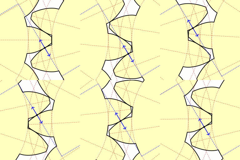
Triangular/trapezoidal profile is commonly used only on gear racks:

or when we need the gears to come in to and out of engagement with each other without binding. If you use triangular profile, the torque transfer is irregular and there is be a lot of binding at some points and slop at others:

Finally, the common count of teeth on a gear is commonly something around 20.
sobota 18. prosince 2021
Fraying apple cables
Low-voltage cables from Apple chargers are infamous for their durability issues:

The issue is caused by repeated torsion of the cable:
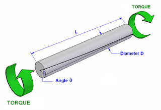
As we expose the cable to torsion, the rubber jacket eventually separates from the braid:

However, this separation is already present from the factory at the cable ends as the braid is pulled to one side:

How to change the cable design to fix fraying:
- Make the rubber jacket thicker. Apple has already done that with Lightning cables. However, this just delays the fraying.
- Wrap the braid in a foil, to separate the jacket from the braid. The jacket will then nicely slide over the foil instead of getting grated by the braid. The common thickness of the foil is 50 μm. But it can be made as thin as 6 μm. Hence, this change could increase the thickness of the cable only by 12 μm. For comparison, typical hair is 75 μm thick.
neděle 1. srpna 2021
Replication crisis and the proposed solution
Remarkably, only 12 percent of post-replication citations of non-replicable findings acknowledge the replication failure. [1]
Roommate submitted his thesis for publication and one reviewer told him "oh, you cited this result from ~30y ago but it actually has a gap in the proof that no one's figured out how to fix yet." (People learn this stuff via the number theory gossip grapevine apparently?) [2]
Google Scholar is in a great position to reduce the "replication crisis", by alerting the users that the listed article is known to have some defect.
Principally, it could work like "disputed" on Twitter or Facebook:


Is it the best UX to show a modal window? Most likely not:
- We want to inform the visitors not just about failed replications, but also about successful replications and small rectifications (like adding a missing condition to a claim or fix of a troublesome typo).
- We do not want to unnecessarily interrupt the visitor’s flow - maybe the visitor is already familiar with the issues of the article or they just don't care about them.
So what? The information about the presence and the overall conclusion of the replicas could be represented with a double-ended bar chart sparkline similar to how Google Translate shows frequency the translation pair (note the red-gray bar graph at the bottom):

When there is a lot of negative evidence, the red bar graph on the left from the black divider is long. When there is a lot of positive evidence, the green bar graph on the right from the black line is long (not present in this case).
How to get it started? Let people mark articles as a replication of other articles.
Why people would bother?
- It is a great opportunity for the authors of replication studies to piggyback (collect citations) on the original, likely popular, articles.
- After a lot wasted time, you might find out that a claim in paper A does not hold. And that there is paper B that has already spot the issue. It's just that you were not aware of paper's B existence. In the rage, you might be willing to spend a minute and complain to the world that paper A has some issue, as noted by paper B.
How to collect feedback? The "piggybacking" articles could be explicitly ranked (up-voted/down-voted) like on StackOverflow. While an explicit feedback is not in Google's style, it is important to realize that Google Scholar is for a niche community and niche communities seem to benefit from the explicit feedback as there isn't enough implicit signal (observe success of StackOverflow, Reddit, Hacker News,...). A nice side effect of that would be an increased engagement due to Ikea effect (People values things, on which they have spend some effort, more than things that they got for free. In this case, people would value Google Scholar more, because they have spent time marking articles as a "rectification" of other orticles).
And what about machine learning? Of course, over the time, Google would collect enough training data, explicit feedback, and implicit feedback, that the pairing of the articles could get fairly reliably predicted. But to get there, Google has to first get the training data.
pondělí 7. června 2021
Microarray classification with background knowledge
The main issue with microarray classification is that the dimensionality is high (feature count > 10000) while the sample count is low (~$100 per sample). We can partially mitigate this issue by incorporating the background knowledge about how the features (genes) are controlled with transcription factors (TF).
I have two proposals: one with a linear discriminant analysis (LDA) and another with a neural network.
Linear discriminant analysis
LDA and variants of LDA, like nearest shrunken centroids (PAM) or shrunken centroids regularized discriminant analysis (SCRDA), are fairly popular in microarray analysis, but they all deal with the problem of how to reliably estimate the covariance matrix because the size of the covariance matrix is #features × #features. PAM gives up the hope of estimating the whole covariance matrix and estimates only the diagonal matrix, while SCRDA only shrinks the covariance matrix toward the diagonal matrix. But with the knowledge of which genes are coregulated together with the transcription factors, we can not only shrink the covariance matrix toward the diagonal matrix, but we can also shrink the coregulated genes together. If the estimate for covariance matrix in SCRDA is: (1-alpha)*cov(X) + alpha*I, where X are the training data, alpha is a tunable scalar and I is an identity matrix, then the covariance matrix in SCRDA with background knowledge is: (1-alpha-beta)*cov(X) + alpha*I + beta*B, where beta is a tunable scalar and B is a block matrix. This block matrix can be generated with the following pseudocode:
# Get the count of TFs that two genes share:
B = np.zeros(len(x))
for tf in tfs:
    for coregulated_gene_1 in tf2genes[tf]:
        for coregulated_gene_2 in tf2genes[tf]:
            B[coregulated_gene_1, coregulated_gene_2] += 1

# Normalize the intersect count by the count of TFs per gene_1 and gene_2:
for gene_1 in B:
    for gene_2 in B:
        B[gene_1, gene_2] /= len(gene2tfs[gene_1]) + len(gene2tfs[gene_2])
The code doesn't do anything else but calculate Jaccard similarity between the genes based on the shared transcription factors. And if (1-alpha)*cov(X) + alpha*I is equivalent to shrinking toward the identity matrix (see "Improved estimation of the covariance matrix of stock returns with an application to portfolio selection") then (1-beta)*cov(X) + beta*B is equivalent to shrinking toward coregulated genes.
Model assumptions: Beyond what LDA does (shared covariance matrices across the classes,...), we also assume that the impact of all the transcription factors to genes is identical.
Neural network
Contrary to the LDA model, the neural network model does not assume that transcription factors affect the genes with the same strength but rather learns the strength. But that also means that we need more training data than in LDA model.
Transfer learning
To make the neural network model viable, we have to also exploit transfer learning: Train the model on some large_dataset and use the trained weights between the input layer and the middle layer as the initialization values for our model on dataset_of_interest. Of course, the same trick can be employed in LDA to shrink the covariance matrix toward the pooled covariance matrix estimated from many different datasets: (1-gamma)*cov(X) + gamma*P, where P is a pooled covariance matrix over many datasets. Hence, the final estimate of the covariance matrix might look like: (1-alpha-beta-gamma)*cov(X) + alpha*I + beta*B + gamma*P.
Conclusion
Both models can be further improved. For example, the assumption of identical covariance matrices per class in the LDA could be relaxed like in regularized discriminant analysis (RDA) and the initial weights in the neural network could be scaled with 1/len(gene2tfs[gene]) to initialize them to the expected value. But that is beyond this post.
čtvrtek 22. dubna 2021
Anti-patterns of two-factor authentication
- Use a password field for the one-time password instead of a plain text field. Password fields hide the password to prevent other people from reading your password from your screen. But in the case of a one-time password, once you use the one-time password, the one-time password is useless. Hence, the password fields for one-time passwords do not really increase the security. However, it increases the probability of overlooking a typo, as the screen does not provide feedback about what you typed anymore. This can be quite a nuisance if you have to use a computer with a different keyboard layout than what you are accustomed to. Bonus points for disabling the clipboard to prevent users from copy-pasting the one-time password from notepad.
- Allocate only enough resources to handle the normal login rate, not the theoretical peak login rate, for critical applications. Most of the time, only a small portion of users attempts to log in at the same time. But when something serious is happening, everyone wants to login in. And when the login system crashes at this stressful moment, it doesn't make people happy.
- Make the login memory-less and batch-less. A memory-less implementation does not remember that you have logged in 10 seconds ago. And batch-less implementation does not allow you to pack multiple privileged commands together. Hence, even if you know ahead that want to issue 10 privileged commands in one go, you are still forced to perform 10 two-factor authentications - one for each command.
sobota 5. prosince 2020
Pandas violates composability
Python Pandas library violates composability. What is a composability? It is the ability to take a part of code and use it as an input for another code.
For example, SQL is composable - SQL takes relations and produces a relation. Lisp is composable - Lisp takes lists and produces a list. Matlab is composable - classical Matlab code takes arrays and produces an array.
But Pandas is not composable. A Pandas method, which takes a DataFrame, may return anything, be it:
- Categorical
- DataFrame
- Group
- List
- Mask (a Numpy vector)
- Index
- IntervalIndex
- Scalar (be it a Python data type, Numpy data type or Pandas data type)
- Series
- Slice
- TimeDeltaIndex
And these are just the one I got after one minute at Pandas API.
Now you may argue: "What's the problem? Python uses duct typing". The issue is, that many Pandas methods, which accept a DataFrame, refuse to work on anything but a DataFrame. And that's the better case. In the worse case, the method accepts it, but produces something else than you would get if you passed the data as a DataFrame.
To make it even worse, Pandas mixes the ways how do you do things. Sometimes, you have to use method of the instance. Sometimes you have to access an attribute of the instance. And sometimes you have to use a class method.
If Pandas was using class methods everywhere, like Numpy, it would be possible to hide the differences between the different data structures. But you don't hide a missing attribute or method of an instance.
Composability is not a small thing. For example, GQL, a new language for graph databases, has composability as the governing principle. And people seem to, knowingly or not, gravitate toward composability. If nothing else, datatable, an alternative to Pandas in Python, ditches Series data structure, as it is considered unnecesary.
středa 18. listopadu 2020
What is wrong with Wikipedia
I like Wikipedia. But I am worried about the future of Wikipedia. Why? Because it keeps growing without limit.
When Wikipedia was based, it got one thing right: the delivery of the information has to snowball. You begin with the minimal quantum of information that is self-sustainable. And then you keep iteratively expanding that. A good article at Wikipedia starts with a self-sustainable sentence, which can exist alone and provides basic description of the keyword. Then there is the rest of the first paragraph, which slightly expands the first sentence. And as the whole, the first paragraph is self-sustainable. Then there is the rest of the paragraphs that make the header. They slightly expand the description of the first paragraph. And together with the first paragraph, they are self-sustainable. And finally, there is the body, which provides the rest of the information and which is, by the fact that it completes the whole article, also self sustainable.
A good metaphor to this concept is the understanding of a picture. With the snowball approach, you first look at the picture from a distance. And you recognize a house. Then you move closer and recognize the front door and windows. You move even closer, and recognize individual parts of the doors. And finally, when you move the closest, you see details like the cracks on the door panels.
In contrast, with pinhole approach you scan the picture pixel-by-pixel. And you have to reconstruct the whole picture your mind.
While the pinhole approach is perfectly fine for computers, humans generally prefer the snowball approach. If nothing else, it allows them to skip irrelevant information like details of the clouds, because from the previous step they already know that that patch of pixels are clouds.
For long time, Wikipedia followed the snowball approach. But now, it keeps shifting to pinhole approach as the bodies of the articles keep growing without any limit.
For me, the current transition from the header to the body is frequently too abrupt. I cope with that by switching from English version of the article to some non-English version, where the articles are smaller. Most of the time, the smaller version provides all the information that I need. But even if it does not answer everything, I at least know which information I seek. And I can then quickly jump to the relevant parts in English version of the article.
But how can the situation be systematically rectified? There are multiple options:
1) Identify an optimal size of the articles and start truncating the overgrown articles.
2) Allow fast time traveling to time when the article was closest to the optimal size.
3) Expandable TOC. Now, TOC doesn't even fit whole screen. Could we by default hide the lowest level headers but on click expand them?
4) Inform Wikipedist that the article is too long and that they should abstain from making it longer. If something, they should make it shorter.
5) Introduce another layer of granularity.
The first approach is politically unacceptable. Wikipedists like to expand articles, not to reduce them. The second approach is meaningful on topics that do not evolve rapidly, like interpretation of ancient events, but fails miserably on contemporary topics. The third approach is a nice technical solution. The forth approach might help a bit. But the last option is the only real solution that might have a chance to succeed.
sobota 11. dubna 2020
My requirements for a data-scientist programming language
United data type and data structures
Reasoning: As a data-scientist, you may want to be able to quickly apply different libraries on your data. But that can work only if they all use the same data representation.Example: R doesn't have a canonical implementation of sparse matrices. Hence, each library uses their own implementation. And if you want to process your sparse data with two different libraries, you frequently have to perform the format conversion over a dense matrix. That's a no go for any non-toy matrix. Matlab got it, in the case of sparse matrices, right: there is only a single format for sparse matrices.
True pass-by-value
Many languages use pass-by-value. But the approaches to make it computationally feasible differ. Python and Java frequently pass-by-value only a reference. While R and Matlab use copy-on-write (CoW), which delivers behaviour that I call true pass-by-value.Reasoning: Data in the operation systems and databases are true pass-by-value. Hence, the expectation is set. R and Matlab got it right.
Working autocomplete
It is nice when autocomplete works on table names, column names, file paths, function names, function argument names... It decreases typo rate, speeds up typing and provides real-time validation - if the autocomplete found the file/table/column/function/whatever, it exists.Example: Thanks to clause ordering in SQL, the table and column name autocomplete doesn't work very well. LINQ got it right: first define tables and only then columns.
Working documentation
As a data-scientist, you may have to work with many different tools. And a good manual can make all the difference when you are learning something new.Example: Python uses multiple formats for documentation and that can cause errors in documentation rendering, when a wrong formatter is used. Java got it right: provide (and enforce) a single documentation format.
Simple copy-paste of matrices
It is nice to be able to simply copy-paste matrices from the result of print(), Excel or publication directly into the interpreter/script code.
Example: Python (and Numpy, Pandas,...) requires commas between the values in a matrix. But when you print a Numpy matrix, it is printed without commas (for improved legibility). That means that you can't simply copy-paste use the printed matrix into your code: you have to first add those missing commas. Matlab got it right: copy-paste from/to Excel works. And parsing of copy-pasted tables from pdfs/web pages frequently even works better than in Excel.
This requirement can be extended to all other data structures.
High-quality and interactive plotting
As a data scientist you may greatly benefit from visualizing the data.Example: The built-in plots in R are static. Matlab got it right: you may interact with the plot. Move overlapping labels a bit. Or read the dato value below the cursor.
Support for functions with many arguments (default values,...)
Argument parsing & validation can take a lot of code, if the language doesn't handle it for you.Example: Matlab doesn't support named arguments in the syntax. But many functions accept something like f('argument_name', 'argument_value'). Since argument names are strings, argument name autocomplete doesn't work. And when you are passing many string arguments, it is difficult for a reader to recognize what is actually the argument name and what is the argument value - they are both strings! R got it right: just like almost any other functional language.
True raw strings
As a data-scientist, you may want to embed different languages (be it regex, SQL or HTML) in your language. And being able to simply copy-paste the foreign code without the need to escape/uneescape makes live easier.Example: In Java, you have to escape backslash in regex with another backslash. Groovy got it right: just use """ """.
Python Pandas
While we should generally avoid equality comparison for detection of None in the code (and use is, respectively isnull()), when we are actually comparing two variables coming from the outside, we may end up comparing None to None. And if we care about the result of the comparison (we do, otherwise why we would bother with the comparison in the first place?), we have to be careful, whether we are comparing the variables with "Pandas logic", or "the rest of Python world logic".import pandas as pd import numpy as np df = pd.DataFrame([None]) x = np.array([None]) print(None == None) # Python says True
print(x == x) # Numpy says True
print(df == df) # Pandas says False
úterý 18. února 2020
Civilization 6
The benefit of the change is more opportunities for tactics. For example, it is possible to replay Battle of Marathon in Jadwiga's Legacy scenario - a single well placed pikeman can indefinitely block a mountain passage against a hoard of knights, till only a single knight can attack the pikeman per turn. Or you may place a city between two large lakes, like real-world Madison-Wisconsin, making it difficult to "flank" the city and put it in to the siege. And of course, 1UPT fixes the infamous Stack of Doom issue.
On the other end, it makes logistics difficult. It happened to me multiple times that I ordered a unit to move forward, only to watch it in horor how it moves backward because all the "resting places" in the forward direction are already occupied by my units. A simple mitigation of the described nuisance is to introduce a keyboard shortcut particularly popular in Microsoft Word: Ctrl+Z. The implementation can take an inspiration from The Battle for Wesnoth turn based strategy, which gives the user the opportunity to take back a miss-click. But to prevent the abuse of the feature by the players, it is not possible to take back a move that uncovers part of a map or a move that lifts fog-of-war. Westnoth also prevents you from taking back a move, which results into a combat. Since Civ 6 still uses randomness in the damage calculation, this limitation would have to be ported as well. The long loading times because of a silly miss-click would be mostly just part of the distant past...
Another irritating thing is that sometimes a victory (or loss) is inevitable. But you still have to get thru many turns to get there. Some people enjoy this part of the game. But I find it boring. It would be nice to have something like "auto combat" or "quick battle" from Heroes of Might & Magic III that would allow you to watch the march to the victory from the resting position of your seat or that would allow you to just skip to the victory screen because you really need some sleep time. Didn't you get the outcome you expected? No worry, just press the sweet Ctrl+Z combo and you can show the computer how it should have been done.
The biggest advantage of having the "fast end" option is that as a developer you do not have to stress yourself so much with fine-tuning the winning conditions. Does the game slip too frequently into the war-of-attrition? Just add "fast end" option. Problem mitigated. Release the game. And leave the re-balancing on the expansion pack.
And finally, the game logic for city states and civilizations should be the same thing. City states are great. But I want to be able to:
- Befriend not only city states but also civilizations with amenities.
- Get unique bonuses not only from being suzerain of city states, but also from being a friend to civilizations.
- Select not only civilizations that appear in the game, but also city states.
- Remove the leader and her/his traits. But the civilization traits would stay there.
- Limit the count of cities to one.
- Adjust things like loyalty bonus,... to actually make the city states work.
neděle 15. prosince 2019
How to kill processes without the necessary privileges
The procedure:
- Open Excel.
- Invoke Windows shutdown.
- Windows will tell you that Excel has unsaved documents. Do nothing. Just wait until all unwanted processes are killed.
- Cancel the shutdown.
- Run regedit
- Go to HKEY_CURRENT_USER\Control Panel\Desktop
- Set AutoEndTasks to 1
pátek 22. listopadu 2019
Old products were reliable, the new one not so much
Products have a variable lifespan. Hence, when we use a century-old item, the item does not break easily, because it was stress-tested for a century and the weaklings were weaned a long time ago. On the other end, when we use a new item, there is a good chance that it won't survive long because it wasn't stress-tested and weaned for a century like the old products that survived to these days.
Another factor is the variable variance of durability. When the distinct count of the manufacturers that produce the product is high and when the manufacturers are independent of each (e.g.: they use only local resources), we may expect high variance in the durability of the products. On the other end, if there is just a few manufacturers or if they all use the same components or design, we may expect low variance in the durability of the products. Hence, some of the products that were produced during the high variance period are likely going to have outstanding durability (just like it is likely that some of them had really terribly low durability). The "issue" with the new products is, that we currently live in a fairly globalized world and many technologies that we use daily were commoditized (standardized and made widely available). Hence, many new items that we use daily have a fairly predictable lifespan. A lifespan, which does not span centuries (because that would be overkill). Consequently, we may sometimes find "indestructible" items that were created when the technology was new. But keep in mind that just like "indestructible" items were produced, there were also "rubbish" items, which were quickly thrown out.
Overall, the data suggest that the quality of manufacturing keeps improving over time. But thanks to selection bias and variable variance, the reverse appears to hold for the item-user.
Addendum: We could model it analytically. For simplicity, assume that probability of a product failure follows log-normal distribution (I picked this distribution because it fulfills three basic properties: it does not allow negative values, it has a long tail and people are familiar with it).
Selection bias can be then illustrated as a difference between probability that a new product fails in the next 10 years vs. a probability that a 100 years old product fails in the next 10 years. The first probability is going to be large, because log-normal distribution is "fat" at the beginning. But once we get to the tail, the derivative of the distribution is going to be close to 0. In other words, if a product survives 100 years, it is actually more likely that it will fail after 10 years than during the next 10 year period.
The variable variance can be illustrated with an observation that whenever an engineer doesn't know how to accurately estimate something, he/she prefers to overestimate the parameters and build the thing robustly. However, sometimes the initial design has a flaw, which reduces the lifespan of the product (hence, the peak is wide - the product can last long but also fail quickly). The next phase is fixing these flaws. But everything else is left as before (the fat from the beginning is removed but the fat tail is preserved - this is the period from which we observe many "eternal" products). Over the time, the product is price optimized (the fat tail is removed - the products have a predictable lifespan without extremes and they all look like garbage in comparison to the eternal products of the past).
čtvrtek 14. listopadu 2019
An app for climbing shoe recommendation

Ideally, an experienced shop assistant should be able to recommend a well fitting climbing shoe based on the look at the client's foot. Shoe, which can provide a snug fit on the client's feet without causing deformities. But my experience is that the salesperson is commonly (and naturally) biased toward the shoes that fit him/her well. Only exceptionally you encounter an expert, who can overcome the bias. But these experts generally (and naturally) work for some brand and if this brand does not make shoe for your type of feet, you are out of luck.
Hence my proposal: an app in a phone, which would take a photo of your feet (a self-photo when you are standing barefoot on the floor), perform some rudimentary calculations (like length-to-width ratio, the ratio of individual toe lengths to the feet length,...), provide some result illustrations in order to persuade the users that your app actually does something (e.g.: overlay the user's foot outline to the prototypical foot) and display shoe ranked from best fit to the worst fit.
There are three obstacles in order to get it working:
- Data collection
- Monetization
- Machine learning
Data collection
First, you have to have some data in order to feed the recommendation system. The best option would be to contact some climbing shoe manufacturer, present them your aim and ask them for their shoe profiles. I do not think that the biggest manufacturer's like La Sportiva are going to be supportive (they may see it as too risky). But the small manufacturer's may see it as a good opportunity for shoving progressiveness and improving their visibility without risking too much. Plus, thanks to the fact that they are small, they can make their decision quickly. And finally, there are many small manufacturers and they vary wildly - it would be surprising if neither of them was eccentric enough to provide you with the data (or allow you to take photos of the shoe lasts...).But the initial measurements are just the beginning. You also have to track what people actually buy and what do they return. And based on that alter the recommendations.
Monetization
Second, if you want the app to be successful in the long term, it has to make money. Or it will eventually die due to technological obsolescence (and lack of your motivation to keep it alive on your side). In this case, the monetization model is simple: a shop/brand that can provide good recommendation will make better sales. The reasoning is simple: whenever a customer has doubts which product to buy, they prefer to postpone their action. And whenever they postpone their action, you risk that they will eventually perform the action (the purchase) somewhere else or that they do not perform the action at all (they stick with their current shoe or they even completely abandon climbing). Hence, the app should allow purchase and return realization in order to collect data and make money.Machine learning
The app must be simple and fast to use. Hence, it is a good idea to not require any measurement with a ruler - a single photo of the foot/feet should be enough.But how to process the photo? I would simply train a convolutional neural network to identify, which pixels belong to a feet and which to the background. I would collect training images of the feet from internet and build the ground truth masks either in Photoshop (for tough photos) or with local thresholding methods (Savuola thresholding for photos with clean background). Since everything relies on getting a good outline of the feet, I would also instruct the users to get the photo of their feet on white monolithic background like a paper or a wall. The paper has the advantage that you can estimate the size of the paper (A4 or letter) based on the paper side ratio and use it for feet size estimation (toe to heel) and perspective correction (as the camera does not always have to be at the same position and always point in the same direction) based on the knowledge that the paper should have right angles.
Once we have an outline of the foot (let's say of the right foot), we should normalize the outline. This is important for visualization (the overlay the user's feet to the prototypical feet) and for feature extraction. I would simple use affine projection of an ideal foot outline to the obtained outline in OpenCV (or whatever is your favourite tool).
Once we have the user's normalized foot outline, we can compare overlay of the user's foot to the inner shape of the shoe. Ideally, there should be a perfect overlap. And the measure of the overlap can be used for ranking of the shoe.
Latter on, once we collect enough data from sells and return records, we could even retrain the convolutional network to directly rank the shoes based on the foot photo. The idea is, that the photo may contain more information than the outline alone. And that the neural network could be better in deciding, which parts of the feet tolerate overly tight/loose fits and which not so much.
Evaluation
At the beginning, the goal will be to get repeatable results. I.e.: when we snap two photos of the same foot, we expect to get the same foot outline and the same shoe ranking. On the other end, when we snap two wildly different foots, we expect different outlines and different shoe ranking.Latter on, we can simply maximize profit (sale margin minus the returns).