pondělí 25. listopadu 2024

Better debugging UI for CTE

One of the great advancements in SQL was introduction of Common Table Expressions (CTE), which made creation of long queries without creating intermediate tables on disk (or temporary tables if the database supports it) convenient.

However, debugging of long CTEs is difficult. To find the bug, I currently use bisection. I modify the query to show the first rows of some intermediate CTE somewhere in the middle of the query. If the CTE result looks OK, the bug is somewhere in the second part of the query. If the result does not look OK, I know that the bug is in the first half of the query. And this process repeats recursivelly, until I pinpoint the single offending CTE.

This approach works well on quickly running queries. However, once each query execution takes long time, the debugging drags as it requires multiple executions to just find the offending CTE, let alone to fix the CTE.

A possible mitigation is to enhance the query editor. Just like some query editors allow you to fold CTEs, the editor should present these information for each CTE:

  1. the CTE's row count
  2. an icon, which on click opens the CTE result

These informations should appear in the editor progressively, as they get available. With this approach, identification of the offending CTE should require, at most, 1 complete query execution. If you are lucky, just by looking at the row count of the intermediate CTEs, you spot the issue while the query is still running.

Technical limitations:

  1. The database ought to support temporary tables. This is needed for a simple implementation of the CTEs' result preview.
  2. While in the debugging mode, optimisation techniques that work across CTEs, like predicate pushdown, will not be applicable. This is acceptable as programmers expect a slow-down in the debug mode. However, it means that there has to be an additional "Debug" button next to the ordinary "Run" button. These two modes can't be mixed.

Future enhancements:
Do we want to store whole CTE results or only the top 1000 rows? If we store whole tables, we can use that to warm start the query execution, once we modify the query. The disadvantage of storing the whole results is that even a single query in the debugging mode can exhaust disk space and consequently prematurelly terminate, while in the ordinary run mode the query may finnish without any issue. Hence, the limit mode will likely have to be implemented. Nevertheless, for testing of the core idea, the limit/warm-start functionality is not needed.

středa 22. listopadu 2023

Google maps' color palette

Once again, google maps changed the color palette. And once again, people are unhappy about it. The change is supposed to improve clarity on low-quality car displays. But it seems to make people with high-quality displays unhappy.

I say, that a single color map can't make everyone happy. Some people are color-blind, hence preferring "50 shades of gray". Other people see the colors but have a crappy display that can't distinctly show more than a few levels of gray, hence preferring "papagayo colors".

The solution is to let people to define their own palette per navigation type (no navigation, by car, by public transit, by foot, by bike,...) and share the palette configurations. This will take care of:

  1. eye and display imperfections,
  2. differences in the opinions of what type of information is important (if nothing else, it is reasonable to assume that this differs from one biome to another),
  3. personal preferences (when you are for years accustomed to one palette, you might prefer to stick to the palette, simply because your brain can navigate the old palette faster than the new one).

neděle 23. července 2023

Dataframe API design

A dataframe is a convenient way how to represent tabular data.

However, dataframe libraries are notoriously tedious to implement, because a dataframe library should be feature-rich.

There were multiple attempts to simplify to problem.

One notable approach is to implement only operations on rows. And if you need to do something on columns, you first transpose the dataframe to convert the columns to rows. This simple trick reduced the size of API (count of methods) by roughly 1/3. Unfortunately, heterogeneous (composing of multiple different data types) dataframes are not the easiest to transpose. The author of the approach solved it by using dynamic typing - each cell contained information about its data type.

Can we further reduce the size of the API? I argue that the answer is yes. Each dataframe should have its own metaframe, which is nothing else but a dataframe with the metadata about the dataframe's columns. Metadata like column names, data types (like in information_schema.columns in SQL databases) and statistics like count of missing values, count of unique values, average, standard deviation and so on, which can be used for queries or query optimization. And these metadata should be manipulable and editable with exactly the same API as dataframe.

Hypothetical examples in Python syntax:
print(df)  # some dataframe instance
print(df.mf)  # the dataframe's metaframe
print(df.some_column_name)  # prints a column named "some_column_name"
 
# Rename a column.
# Commonly we would have a dedicated function or a method for this like:
#    column_name(df)[3] = "new_name"
# or
#    df.rename(columns={"old_name": "new_name"})
# but we reuse ordinary syntax for dataframe manipulation:
df.mf.column_name[3] = "new_name"


# Select columns without any missing value.
# Commonly we would have a dedicated function or a method for this like:
#    df[:, ~any(isnull(df))]
# or
#    df[:, ~df.isnull().any()]
# but we reuse ordinary syntax for dataframe manipulation by using missing_values column in the metaframe:
df[:, df.mf.missing_values == 0]

# Select columns with "good" substring.
df[:, regex(df.mf.column_name, ".*good.*")]

# Select integer typed columns.
df[:, df.mf.data_type=="integer"]

# Cast a column to string. Implementable with https:#stackoverflow.com/questions/51885246/callback-on-variable-change-in-python
df.mf.data_type[3]=="integer"
Metaframe should be open for addition of new columns as needed. For example, do you want to calculate feature importance and then filter based on that? Sure enough we can store the feature importance in an independent array and then filter based on the array:
feature_importance = get_feature_importance(df)
df[:, feature_importance>0]

But what if there are intermediate steps between feature_importance calculation and filtering, where you manipulate column position or add or delete columns? Suddenly, you have to keep feature_importance array synchronized with the df. And that can be tedious and error prone. But if you store feature_importance into metaframe, the dataframe library will take care of keeping it synchronized (when you add columns, the corresponding feature_importance value will be null - no magic).

However, if you wanted a bit of magic, the library might keep track of operations performed on columns and keep lineage of the columns. For example, the library might track which dataframes and columns were used in computation of the columns. This is useful in complex systems where it is sometimes difficult the origin of some data.

Implementation

Because we want to treat a metaframe as if it was a dataframe, metaframe has its own metadata. Hence, we get a never-ending chain of frames. This can be implemented as a linked list.

Without loss of generality, let's assume that each dataframe has 2 mandatory metadata attributes:
    column_names,
    data_types.
Additionally, each dataframe can have an unlimited count of optional metadata attributes, e.g.:
    roles,
    interpretations,
    notes,
    ...

Then the chain of the frames will eventually start to repeat with:

2 mandatory columns [column_names, data_types] and 2 rows that in column_names have: ["column_names", "data_types"].

We can treat it as a "sentinel node" in linked lists, which marks the end of the list - once we encounter it, it will be just referencing itself. Note that a single global "sentinel" can be shared by all frame chains.

However, if we want to make the data structure easier to serialize, we had better to avoid never-ending loops. To do that (and make the space overhead smaller), we might just use null in places, where we would reference the "sentinel" - it would be then up to the code to handle nullable metaframes (be it in the library or user code).


úterý 16. května 2023

Summary evaluation for Wikipedia

Wikipedia articles, at least in English, tend to be overgrown - they contain a lot of information of mixed importance. However, we do not always have time to go thru all the content. It helps that articles are structured to have the most important things in the first sentence/paragraph. However, the importance is not really differentiated within the body. If you have to read the body, you get swamp. I use two tricks to deal with that: 1. Switch to a different language. The idea is that articles in different languages are smaller. However, they still contain the most important information. 2. Use a historical version of the article. The idea is that the most important information was entered before the less important information. People are obsessed these days with text-generative AI. Hence a proposal to use AI for shortening of English articles. Do you need a short description? Generate just a single sentence. Was it not enough? Generate the rest of the paragraph. Need even more? Write a subtopic, which interests you. How to evaluate the quality of the summaries? A. Machine translate all different language variants of the article into English and check the information overlap between the summary and the language variants. Ideally, the overlap will be large. This exploits trick #1. B. Check the overlap between the summary and historical versions of the article. Ideally, the information in the summary will be present even in the old versions of the article. This exploits trick #2. Limitations: 1. Some important information is known only from some date. For example, election results are not available before the results are announced. This can be corrected by observing how quickly given information spreads across different language versions. If the information spreads quickly, it is likely important information, even though it is young information. 2. Language variants are highly correlated because they copy from each other. However, it is reasonable to assume that, for example, English and Spanish are more correlated than, for example, Tuu and Thai, simply because fewer people speak both Tuu and Thai than English and Spanish. If the compensation of these differences is necessary, estimate a correlation matrix on the data and use it to weight the signal.

čtvrtek 10. března 2022

Gear icons

System Preferences icon in macOS 12 uses frustrating gears:

The reasons why they are frustrating:

  1. The tooth's cross section is triangular.  
  2. The teeth are narrower than the space between the teeth.
  3. There is too many teeth.

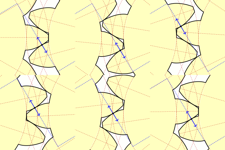
Commonly, the teeth are curved to ensure good meshing of the gears:

Triangular/trapezoidal profile is commonly used only on gear racks:

or when we need the gears to come in to and out of engagement with each other without binding. If you use triangular profile, the torque transfer is irregular and there is be a lot of binding at some points and slop at others:

Furthermore, when two gears are made from the same material, it makes sense to use as wide teeth as the gap between the teeth to maximize the durability of the gearing.

Finally, the common count of teeth on a gear is commonly something around 20.


sobota 18. prosince 2021

Fraying apple cables

Low-voltage cables from Apple chargers are infamous for their durability issues:

The issue is caused by repeated torsion of the cable:

As we expose the cable to torsion, the rubber jacket eventually separates from the braid:

However, this separation is already present from the factory at the cable ends as the braid is pulled to one side:

This separation is troublesome because when we further twist the cable, the braid works like a grater, which "eats" the rubber jacket. And eventually, the cable frays.

How to change the cable design to fix fraying:

  1. Make the rubber jacket thicker. Apple has already done that with Lightning cables. However, this just delays the fraying.
  2. Wrap the braid in a foil, to separate the jacket from the braid. The jacket will then nicely slide over the foil instead of getting grated by the braid. The common thickness of the foil is 50 μm. But it can be made as thin as 6 μm. Hence, this change could increase the thickness of the cable only by 12 μm. For comparison, typical hair is 75 μm thick.
Conclusion: It is well known that Apple uses badly designed "strain reliefs" at the cable ends. But that does not explain why the cables fray in the middle (as illustrated in the first photo) as well and not just at the ends.

neděle 1. srpna 2021

Replication crisis and the proposed solution

Remarkably, only 12 percent of post-replication citations of non-replicable findings acknowledge the replication failure. [1]
Roommate submitted his thesis for publication and one reviewer told him "oh, you cited this result from ~30y ago but it actually has a gap in the proof that no one's figured out how to fix yet." (People learn this stuff via the number theory gossip grapevine apparently?) [2]

Google Scholar is in a great position to reduce the "replication crisis", by alerting the users that the listed article is known to have some defect. 

Principally, it could work like "disputed" on Twitter or Facebook:


Is it the best UX to show a modal window? Most likely not:

  1. We want to inform the visitors not just about failed replications, but also about successful replications and small rectifications (like adding a missing condition to a claim or fix of a troublesome typo).
  2. We do not want to unnecessarily interrupt the visitor’s flow - maybe the visitor is already familiar with the issues of the article or they just don't care about them.

So what? The information about the presence and the overall conclusion of the replicas could be represented with a double-ended bar chart sparkline similar to how Google Translate shows frequency the translation pair (note the red-gray bar graph at the bottom):

When there is a lot of negative evidence, the red bar graph on the left from the black divider is long. When there is a lot of positive evidence, the green bar graph on the right from the black line is long (not present in this case). 

How to get it started? Let people mark articles as a replication of other articles. 

Why people would bother? 

  1. It is a great opportunity for the authors of replication studies to piggyback (collect citations) on the original, likely popular, articles. 
  2. After a lot wasted time, you might find out that a claim in paper A does not hold. And that there is paper B that has already spot the issue. It's just that you were not aware of paper's B existence. In the rage, you might be willing to spend a minute and complain to the world that paper A has some issue, as noted by paper B. 

How to collect feedback? The "piggybacking" articles could be explicitly ranked (up-voted/down-voted) like on StackOverflow. While an explicit feedback is not in Google's style, it is important to realize that Google Scholar is for a niche community and niche communities seem to benefit from the explicit feedback as there isn't enough implicit signal (observe success of StackOverflow, Reddit, Hacker News,...). A nice side effect of that would be an increased engagement due to Ikea effect (People values things, on which they have spend some effort, more than things that they got for free. In this case, people would value Google Scholar more, because they have spent time marking articles as a "rectification" of other orticles). 

And what about machine learning? Of course, over the time, Google would collect enough training data, explicit feedback, and implicit feedback, that the pairing of the articles could get fairly reliably predicted. But to get there, Google has to first get the training data.